Did you get the memo? … finding the subField of a string

lumbergh

Just a quick post (yes, I know I still owe you a PART 2 for the accumulating data post) ..

Situation

I am dealing with a string which has an arbitrary number of words in it. Each word is separated by a space. I want to get the last word. (ahem!)

Solution

I was not aware of this, nor do I see it in the documentation, but by feeding -1 as the index to subField(text, delimiter, index) we get the last subField.

Example:

subField('this is a test', ' ', -1)    // returns 'test'

subField('this is yet another in a big test', ' ', -1)  // also returns 'test'


Using this in a production code I would probably play it safe by wrapping a trim() function around my text string in case there are trailing spaces:

subField(trim([Some Field]), ' ', -1)

It’s quite possible everyone already knows about this and I didn’t get “the memo” … but just in case you find it useful – have fun!

(uhhh… and I’ll go ahead and make sure you get another copy of that memo, umm-kayyyy?)


ADDENDUM

Just an update — not surprisingly, this technique also works with findOneOf(..). That is, if you supply -1 as the index to findOneOf(text, delimiter, index) it will return the position of the last instance of the delimiter.

Example:

findOneOf('this is a test', ' ', -1)     // returns 10; the position of the last space
 
 
Keep on Qlikin’
– Bill


Shares

The Trouble With Totals – those pesky accumulations

ST_TroubleWithTribbles


The trouble

I don’t know about you, but I find it VERY easy to run into trouble (a.k.a. BUGS) when implementing accumulations in charts in Qlik. I’ve probably made every mistake possible at one time or another. Especially when working with averages, it can be very easy to make an “unnoticed mistake” … once again, the Bug-word.

I’ve gone back and forth with various techniques over the years. Henric has a nice, comprehensive post on the topic at his Qlik Design Blog. I’ve recently been striving to use an AsOf table in my apps, due to its easy of implementation. But I’ve found some serious shortcomings in that approach that I’ll address here.

Speaking of ease of implementation … Rob Wunderlich has a subroutine for the AsOf table in his awesome Qlikview Components library. And if you want to see the guts of building one, Barry Harmsen walks through an example in his Data Modeling class at the MastersSummit for Qlik.

The setup

To motivate this discussion with a typical business reporting scenario, let’s suppose we have daily sales amounts and we need to report both monthly sales, as well as a six-month rolling average. I bet 99.9% of you reading this are nodding your head, having been asked this question before.

One key requirement is that the user needs to be able to focus on a particular year (i.e. select a year in a list box) and see proper rolling-six month results … this is where it gets tricky.

Some approaches to accumulating

Built-in accumulation

The built-in accumulation feature (found on the Expressions properties tab) sure is easy to implement. It only requires clicking a checkbox and then choosing how many “buckets” to accumulate. These buckets are dimensional slices in the chart’s “mini-cube” of data. (Yeah, I know, I said “cube” in a QlikView post – BAD! But that’s how I try to visualize the chart data.)

builtin_accum_props

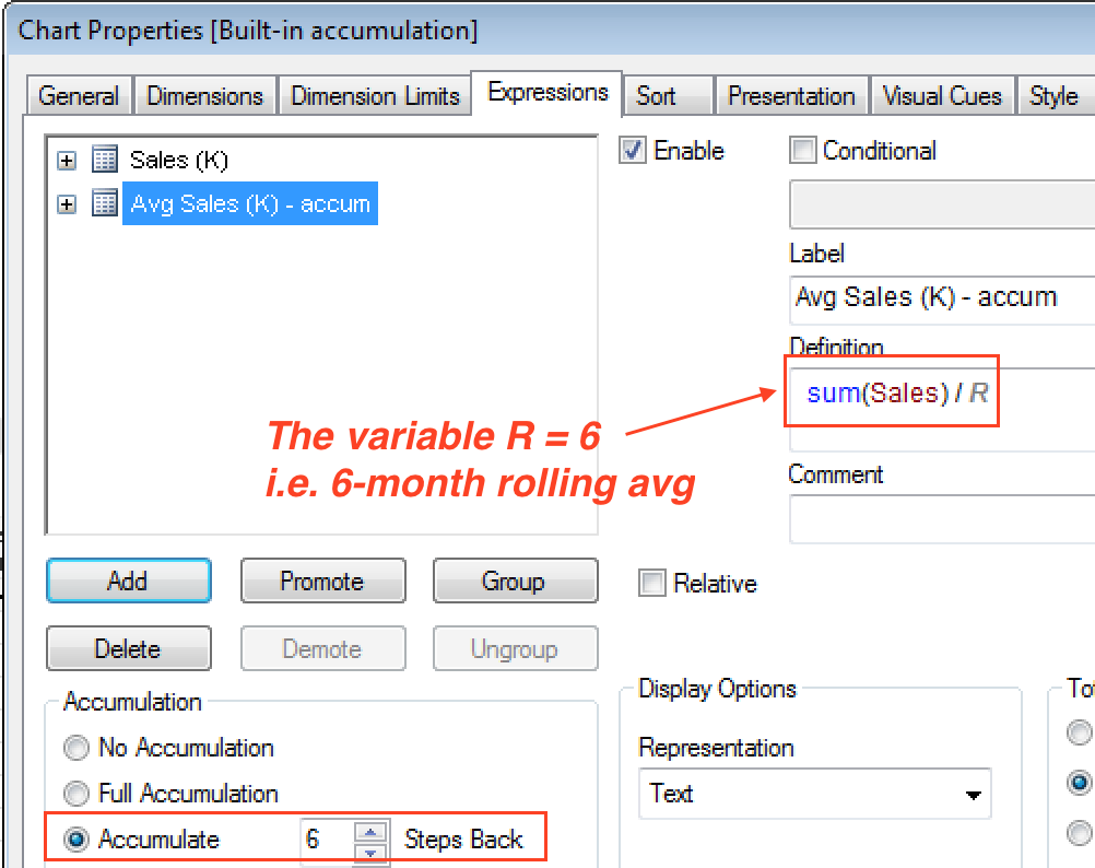
Note that since the accumulation only sums the six rows, they need to be divided by six to get an average. The variable R is assigned a value of 6 in the load script.

LET R = 6;

But as might be expected, with the super-simple setup comes very little in the way of value. The accumulation is limited to the data with the chart, specifically the values on each row. As soon as a selection is made, you’ll see that the accumulation is re-calculated, based on the selection scope. Boo. Hiss.

builtin_accum_2

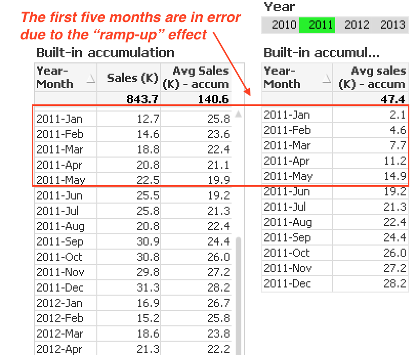
In the example here, the chart on the left is detached (in truth, I’m using alternate states). But the chart on the right is responding to the Year list box. When 2011 is selected, the accumulation breaks because it can no longer “reach into” the 2010 data to calculate the rolling six-month average. I call this the “ramp-up” effect.

Inter-record chart functions

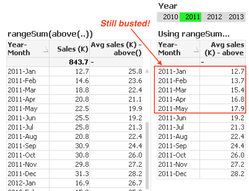
Let’s try a completely different approach — the chart inter-record functions. Specifically, we’ll use the above() function to reference prior rows in the chart. And then use the rangeAvg() function to average over these rows. You can probably already guess where this is heading …

The rolling six-month average expression is:

rangeAvg(above(sum(Sales), 0, 6))

Although we had to do a little more work on this approach, the result are no better. The chart still suffers from selections.

rangeavg_above

It’s at this point where I usually give up with the front-end only approach. However, I was recently shown something by one of our Masters Summit attendees where he successfully wrote an expression (a very, very complex expression!) that handled the calculation. It made my head hurt just to look at it. 🙂

So let’s look at some things we can do in the data model …

AsOf table

The AsOf table is a dimension table that I think of as a “half-Cartesian” table in that it creates a row in the table for each month, combined with every month that came before it. The mathematically-inclined might think of it as a triangular matrix.

So in our toy model of a Calendar dimension and Sales fact table, the AsOf table will associate to the Calendar on the [Year-Month] field. And each Year-Month in Calendar will generate a multiple rows in the AsOf table going from that month, back to the first month in the database.

asof_model_1

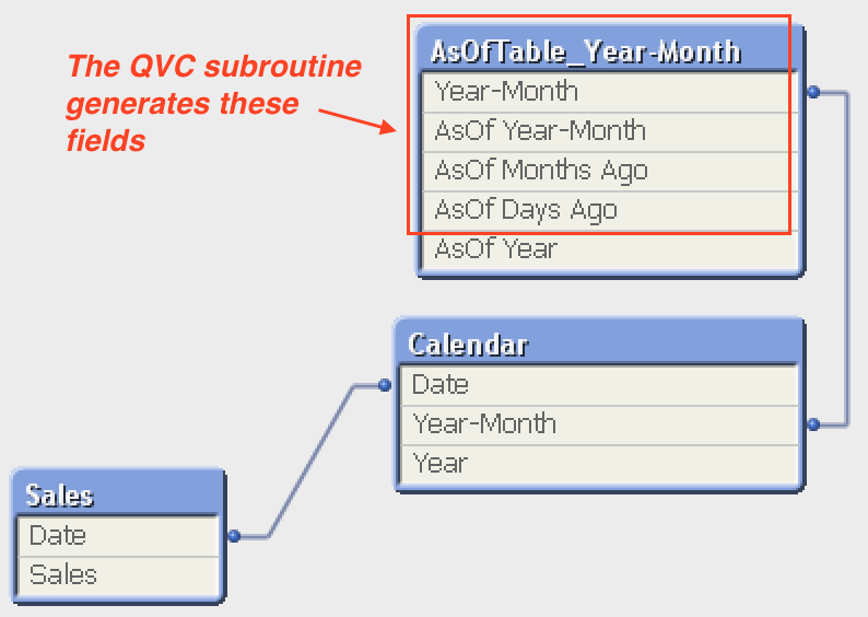
The field [AsOf Months Ago] is handy for limiting how many rows from the AsOf table to include. So for our rolling six-month example, the expression for the chart is:

sum( {< [AsOf Months Ago] = {"<6"} >}  Sales ) / R

We use less-than here (as opposed to less-than-or-equal-to) because the month itself is 0 (zero) months ago. That is, our rolling six-month calculation considers the current month, plus each of the five previous months. (Note the R variable is still needed in the divisor to get from the sum to the average.)

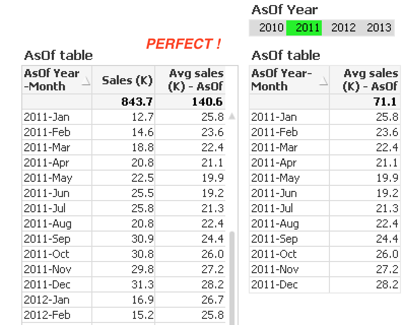
Great! Right? Well … for this to work, then our chart dimensions AND our selection dimensions (list boxes) must use the AsOf table fields. Huh?!

It is each AsOf Month-Year that links to the previous years. So [AsOf Year-Month] becomes the chart dimension. And any selections must be made in [AsOf Year-Month], not [Year-Month].

A handy field to include

I like to have a Year field in the AsOf table too. This is not included in the QVC implementation but is certainly easy to add in the load script:

JOIN
([AsOfTable_Year-Month])
LOAD
[AsOf Year-Month],
year([AsOf Year-Month]) AS [AsOf Year]
RESIDENT
[AsOfTable_Year-Month];

With this additional field, I can now make selections by creating  a list box on [AsOf Year]. Finally then, I can select a subset of the chart and still get the same, accurate rolling six-month average. Yay.

asof_result_1

But I’m still troubled

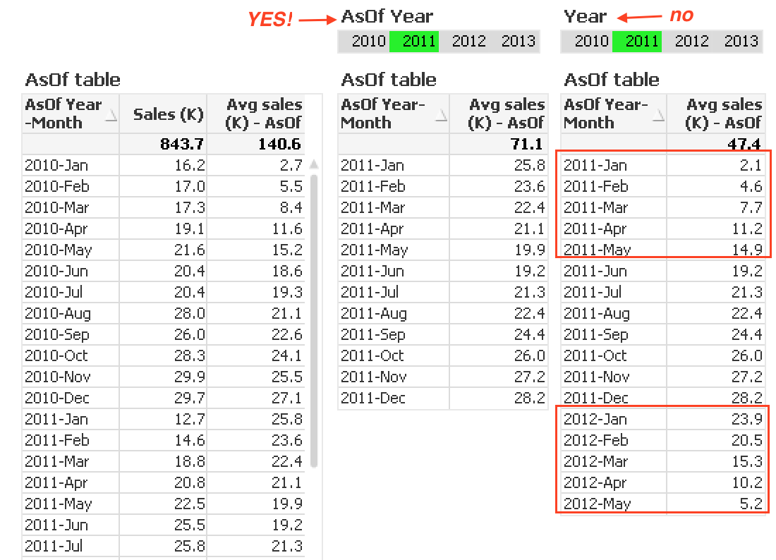
The AsOf solution looks great at this point … until it is needed in a real application, not just a simple toy model. In a real application, there will no doubt be at least one significant date dimension, by which most filtering is done. This is typically manifest in Year, Month, Quarter, etc. list boxes in the dashboard.

For example, in our model, let’s assume the Year field is in a list box at the top of every sheet in the app. That simply will not work with the AsOf table. And vice-versa — the [AsOf Year] field will not work with the non-rolling expressions.

Here you can see that selecting Year = 2011 breaks the rolling six-month average:

asof_result_2


So now what … ??

Well, I’m going to pull a “who shot J.R.” on you and save that for my next post! 🙂

(and if you don’t know who shot J.R., it’s worth a Google)

Shares

Importing Tasks via Remote Management – Step-by-Step

I recently moved a client’s dev/test environment onto a new server. There were a few dozen reload tasks and rather than recreate them by hand, I chose to use the Import Task feature via the QMS Remote Management service.

I’ve known about this feature but have never had a chance to use it. I looked through QlikCommunity forum and did some googling to get more info but I didn’t find a lot. Specifically, there did not seem to be a single resource that laid out the steps to do the import. Hence the following post…

The process is fairly straightforward and intuitive. Below are the steps I followed. (This is on QlikView 11.2 SR6, by the way. Windows 2008 R2 Enterprise OS.) In my environment there was the remote server — let’s call it the OLD server, and the target server — we’ll call it the NEW server. And I had previously stopped all QV services on the OLD server and set them to Manual.

Preparing the OLD server

  • Turn on the QMS service – I don’t know if this is explicitly required (it would be easy enough to test), but at a minimum I wanted to be able to get into the QMC on my OLD server to look at things
  • Create a local “QlikView Management API” group on the OLD server – be sure to name it exactly that

qms_remote_group_define


  • Add members to QlikView Remote Management group – I added my domain service account that runs all the QV services. Although you could add a different account to run the import (you’ll need to supply login info on the NEW server if you do that.)
  • Confirm you have the group setup correctly – use the Users tab in QMC on the OLD server for this

qms_remote_group


  • Create an inbound firewall rule to allow domain traffic on port 4799 (this is the default port for the Remote Management service)

qms_remote_inbound_rule


Preparing the NEW server

On the NEW server, all the preparation is done within the QMC, in the System > Setup tab. I’m going to walk through the steps as if you want to import ALL tasks (as opposed to selecting specific tasks for import).

  • Go to the Remote Management Services section and click the plus sign to create a link
  • Replace the default server name with the name (or IP) of your OLD server, and click Apply

qms_remote_setup_1


  • If you intend to run the import with a user account other than the QV service account, go to the Login tab and enter credentials and Apply
  • Go to the Source Folders tab and you should see a list of folders From the OLD server. For each of these, map them to a folder on your NEW server. Click Apply.
  • NOTE: if you do not map all source folders, you’ll receive an error message when you attempt to import all tasks

qms_remote_folder_mapping


  • Go to the QlikView Servers tab and map the name of the OLD server to the NEW server. In my case, because I had done some name-switching, these were the same name, but the mapping is still required. Apply.

qms_remote_server_mapping


  • You can optionally choose to disable triggers after tasks are imported

qms_remote_setup_2


Importing tasks

Now that the link is established, the task import is quite simple.

  • Go to the Documents > Source Documents tab, right click on any folder or the top-level “gear” icon and choose “Import Tasks”
  • You’ll be presented with a new window with an expandable tree of your source folders. Click the top-level to select all tasks and click OK. You will be prompted to confirm.

qms_remote_confirm

  • Voilà!


Caveat

I had read that the triggers of the type: “On event from another task” would not be created unless all tasks are imported. However, even though I did indeed import all tasks, none of the triggers were preserved. This was not the end of the world, but certainly eroded the value of the import. <– Wrong! See “IMPORTANT EDIT” below .

IMPORTANT EDIT – Aug 01, 2014

So…it turns out that the triggers (including the “One event from another task” triggers) were indeed created on the import. But because I had triggers disabled, the “links” did not appear. Once I started selectively enabling triggers, the Tasks screen showed the serial task chains as I expected.

So I hope you find these steps useful if you need to do a migrate. I will undoubtedly be referring to them in the future when I forget the steps! 🙂

Keep on Qlikin’

(keep on Sensin’ ?? )

Bill

Shares

Highlighting Redux – Alternate States to the Rescue!

The year was 2010 … Katy Perry and Lady Gaga topped the charts. Gas was $4.00 a gallon. A beer in Los Angeles cost five bucks. And dynamic highlighting of dimensional values in QlikView charts (a.k.a. brushing) needed a data island. AND I did a post on this topic: Highlighting a “special” dimension in bar charts.

Fast forward to Summer 2013 … okay, not much has really changed in the bigger picture but WOW is it easier to do brushing in QlikView. Actually, this is not really a new technique because I’m going to employ alternate state to do this trick which has been around since version 11 first came out.

What’s wrong with the old method?

Recall the challenge with brushing is that we want to provide users the ability to dynamically focus on one dimension value (i.e. make a selection), but we don’t want the other dimension values to vanish. Prior to version 11, this could be accomplished by using a data island (i.e. a stand-alone table that does not associate to the rest of the data model) that will provide a dimension for the users to make selections. And this dimension is necessarily decoupled from the model because it is an island.

This approach works fine, but it’s cumbersome to have to create an island table for every dimension that may be used for brushing. How can we simplify that step…..

It just got easier – Altered States!

If we think for a moment how the old method worked – that is, we decoupled the brushed dimension from the chart … which we did via the data island. Alternate states is another way to decouple data entities, and the good news is that we do NOT need to build additional tables to do it.

We will use this technique to provide brushing capability to call-out a category for new construction spending. (Note: these data are publicly available from the US Census Bureau.)

So here is the high-level algorithm we need to employ:

  1. Create an alternate state – let’s call it “A”  (without the quote symbols)
  2. Create a list box for the user to select the brushed dimension – PUT THIS LIST BOX IN STATE A
  3. Create the chart – put the chart in the default state
  4. Fine-tune the bar color in cases where the chart dimension matches the brushed dimension

Let’s break this down step by step:

Step 1 – create an alternate state

The really, really easy step … go to the Document Properties and click on Alternate States to bring up the dialog box. Add a state and call it A. (Note: I also have a state called B in the image).


Step 2 – create a list box in State A

Create a list box on the chart dimension – [Category Desc] in our case. Be sure to assign the state to A in the General tab of the list box properties.


Step 3 – create the chart

Be sure that the chart is in the inherited state; i.e. the Default state (not the A state).


The chart itself is quite simple with a single dimension: [Category Desc].


And a single expression: sum(Spend)


Step 4 – fine-tune the bar color

The bar color can be grossly controlled by the setting on the Colors tab in the chart properties. But we can also finely control the color; i.e. by using a data-driven expression by expanding the expression (on the Expressions tab of properties) and manipulating the Background Color.

The expression we need to use here will compare the chart’s dimension [Category Desc] (which is in the Default state) to the value the user selects for [Category Desc] in the A state. If the two value match, then color that bar differently than the rest — this is the “brushing.”

if(match([Category Desc], only({A} [Category Desc])), $(vData2Color))

where vData2Color is the rgb() definition for an emphasis color (pull out your copy of Few’s “Information Dashboard Design” if you need inspiration.)

Notice that invoking the alternate state is as simple as putting the state’s name A in the set definition.

The result …

The final result is a chart that in which any of the bars can be dynamically “brushed” by the users.


More of this at Masters Summit – Europe!

This is one of the topics I’ll be covering in my Visualizations course at the Master Summit in Europe in October. Rob, Oleg, Barry and I will be sharing our techniques with students from the UK and Spain – hope you can join us!


Keep on Qlikin’

Bill

Shares

REBOOT! an awesome trick to simulate OnOpen

Do you use OnOpen triggers in your application? Isn’t it a pain to have close and then re-open the app to test them?

I accidentally happened across a very cool technique to simulate the re-opening, and thus re-triggering of the actions. It’s as simple as toggling the WebMode.

  1. Enable WebMode by clicking the button in the tool bar
  2. Click it again to turn it off, and the OnOpen triggers will fire


Too easy, huh?!


Keep on Qlikin’

Bill

Shares

QlikView 11 for Developers – an excellent tome

I just read an excellent book by Miguel Garcia and Barry Harmsen – “QlikView 11 for Developers.” I highly recommend it for beginning and intermediate QlikView developers. I even learned a few things myself! Like the pick(dimensionality(…), …) trick.

QlikView 11 for Developers at PacktPub

Miguel and Barry are two of my favorite bloggers by the way.
Miguel: iQlik – Everything QlikView
Barry: QlikFix.com

Shares

Set Analysis & Alternate States – Quick Tip

I recently had my first opportunity to use Alternate States on a real project. As awesome as I think Alternate States are, I just haven’t had a chance to implement them before now.

As I was developing the expressions for my charts, I came across a predicament. And after some hand-wringing and head-scratching I realized it was a result of how I’ve been treating the set identifier, $.

As a reminder the set identifier $ is the default set. It represents the entire data model PLUS all user selections. Insofar as it is the default, it doesn’t need to be explicitly included in the expression. Meaning, when the $ is omitted in a set analysis expression, QlikView defaults to the default set. In other words,

sum({ $ } Sales) is equivalent to:   sum(Sales)

just as

sum({ $ <Year = {2010}> } Sales) is equivalent to:   sum({ <Year = {2010}> } Sales)

(notice the dollar-sign is absent in the 2nd expression)

Now, although the $ is not required, I have diligently included it in any and all expressions that use set analysis, rather than letting QlikView default it. My reasoning on this was to prefer the explicit over the implicit, i.e. leaving nothing to chance and more importantly, improving code understandability. And I’ve coached my students and clients to do the same.

“Always include the dollar-sign.”

B. Lay, said to dozens of students

…turns out that wasn’t such great advice!!


$ vs. Alternate States

So here comes the rub …

Without alternate states, the situation is simple: there is one and only one “default” state ($); namely the state of all user selections. But with alternate states defined, the concept of a “default” is no longer simple.

Instead of a single “default” state there are now:

  • the document default state, $ – this is the state we’re familiar with prior to version 11
  • a sheet state – which could be $, inherited from the document-level or one of the alternate states
  • an object state – which could be $, inherited from the sheet-level or one of the alternate states

Additionally, any expression in any object can either inherit the state of the object or be controlled via set analysis. And this is the key pointsum({ $ } Sales) and  sum(Sales) now have potentially different meanings.

By hard-coding the $ in the set, we are explicitly choosing the good old-fashioned default state – all user selections. This ignores the alternate states. In fact, even if the object is assigned to an alternate state, by placing the $ in the set expression we are ignoring that alternate.

Contrast this to omitting the dollar-sign: sum(Sales) In this case we are accepting whatever state the object is in. That could be the default set $ … or it could be an alternate state, if indeed the object is assigned to an alternate state.

By omitting the dollar-sign we are allowing the set expression to “inherit” the object’s state.

My Mistake

Back to my issue (it’s all about me!) … I had created two identical charts, one in State A and the other in State B. And two groups of list boxes, one State A and the other in State B. Each chart had several expressions and included set analysis (for other calculation reasons). Here are the details (note I’m obscuring the client’s actual field names):

  • Chart 1 – State A
  • Expression 1: sum({$ <CurrYTD = {Y}>} Sales)
  • Expression 2: sum({$ <CurrYTD = {Y}>} COGS)
  • Expression 3: sum({$ <CurrYTD = {Y}>} Units)
  • Expression 4: sum({$ <CurrYTD = {Y}>} #OrderCounter)


  • Chart 1 – State B
  • Expression 1: sum({$ <CurrYTD = {Y}>} Sales)
  • Expression 2: sum({$ <CurrYTD = {Y}>} COGS)
  • Expression 3: sum({$ <CurrYTD = {Y}>} Units)
  • Expression 4: sum({$ <CurrYTD = {Y}>} #OrderCounter)


So this is following my old-fashioned approach of always including the set identifier $.

Hence, to my chagrin, when I clicked on values in my State A and State B list boxes, nothing changed. Again, because I had overwrote the object state by using a $ in my set analysis expressions. The fix for this was quite easy; simply removing the $ from the expressions.

  • Chart 1 – State A
  • Expression 1: sum({ <CurrYTD = {Y}>} Sales)
  • Expression 2: sum({ <CurrYTD = {Y}>} COGS)
  • Expression 3: sum({ <CurrYTD = {Y}>} Units)
  • Expression 4: sum({ <CurrYTD = {Y}>} #OrderCounter)


  • Chart 1 – State B
  • Expression 1: sum({ <CurrYTD = {Y}>} Sales)
  • Expression 2: sum({ <CurrYTD = {Y}>} COGS)
  • Expression 3: sum({ <CurrYTD = {Y}>} Units)
  • Expression 4: sum({ <CurrYTD = {Y}>} #OrderCounter)


The Takeaway

Well, despite the resiliency of old habits 🙂 I will now be omitting the $ in my set expressions.


Keep on Qlikin’

Bill

Shares

Nifty trick for INLINE tables

Here’s a nifty little trick I discovered by accident when creating INLINE tables…

Some Motivation

Typically when I’m creating an INLINE table it’s for one of two reasons:

  1. I’m working very quickly and need to generate some additional data.
  2. I’m building a control table to use as part of the ETL script. For example, setting up a loop and I want to pull a value from the INLINE table into each loop iteration.

The technique I’m going to demonstrate is relevant to usage #1 above. In fact, it’s only useful if I’m going to base my INLINE table (in part) on data that already exist in my data model.

Consider this specific example:

  • We are building a Global Sales Analysis application
  • We have a Country field in our associative model
  • We wish to also analyze sales by Region: {EMEA, APAC, Americas} … but we don’t have a data source for this

What’s the easiest way to “append” the Region onto each Country record …. ???

The Trick

In the past, when faced with the use case as described above, I would do the following:

  1. Create a List Box on Country.
  2. Then right-click and copy possible values.
  3. Then paste those values into Excel for further manipulation. Or more typically paste them right into the INLINE load wizard.

BUT, there is a simpler way to achieve this, if you take note of a curious little “Tool” menu inside the Load INLINE table wizard…

Step One

Make sure the source field already exists in the data model. In our example it’s the Country field.


Step Two

Go into the Script Editor (ctrl-E) and go to the Inline table wizard:

Insert > Load Statement > Load Inline


Step Three

Check out the Tools menu inside the Inline Data Wizard window


Click on it and select the Document Data… option


Step Four

Locate the source field in the list of Available Fields. You will have an option to select All Values (this is what I always end up using) or take advantage of the associative model if selections have already been made in the dashboard.


Step Five

The wizard then populates the values from the source field into the first column of the table


Step Six

The second (and subsequent) columns can now be manually populated. Which in our use case is adding the Region {EMEA, APAC, Americas}


The Final Product

Clean it up and reload. And the final result should look like this:


I hope you find a chance to use this shortcut in your future projects.

Keep on Qlikin’

Bill

Shares